FangQuant › Strategies
New indicator to analyze the arbitrage opportunities between sse50 and csi500
The data: the daily closed prices of sse50 and csi500 since April 16th,2015
rt<-read.table("sse50&csi500.txt", head=T)
x=as.numeric(rt$sse50)
y=as.numeric(rt$csi500)
cor(x,y) lm1<-lm(y~x)
The correlation between these two index futures is 91.24%.
With the one-dimensional linear regression and the liner model is:
CSI500 = 3.134* SSE50 – 542.209
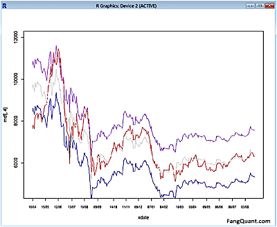
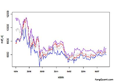
As shown in the picture above, the red line is the actual data of CSI500 and the grey line is the fitted data based on the linear model.
The purple line is the upper bound of the prediction, and the blue line is the lower bound of the prediction.
Code as the following:
par(mfrow=c(2,2))
plot(lm1)
par(mfrow=c(1,1))
dfp<-predict(lm1,interval="prediction") mdf<-cbind(dfp,y) xdate=as.Date(rt$Date) plot(xdate,mdf[,4],type="l",col="red",xlab="date",cex.axis=0.7,ylab=ylab,ylim=c(ymin,ymax),xaxt="n")
lines(xdate,mdf[,1],col='grey')
lines(xdate,mdf[,2],col='blue')
lines(xdate,mdf[,3],col='purple')
step=ceiling(length(xdate)/10)
axisx=xdate[seq(1,length(xdate),step)]
axis(1,axisx,format(axisx,"%d/%m/%y"),cex.axis=0.7)
The significance test:
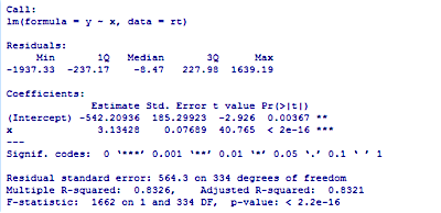
As the p-value is much less than 0.05, we reject the null hypothesis that β = 0.
And the Adjusted R-squared =0.8321, close to 1.
Hence there is a significant relationship between the variables in the linear regression model of the data set faithful.
To use R’s regression diagnostic plots,
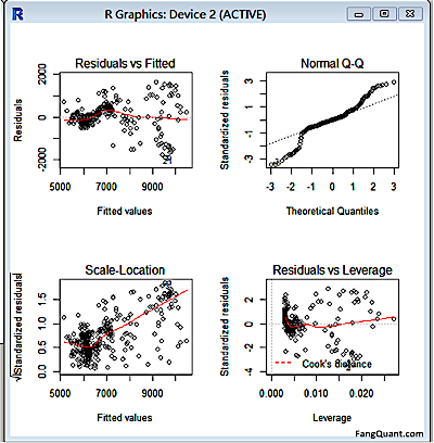
The first plot (residuals vs. fitted values) is a simple scatterplot between residuals and predicted values. It should look more or less random.
The second plot (normal Q-Q) is a normal probability plot. It will give a straight line if the errors are distributed normally.
The third plot (Scale-Location), like the first, should look random. There is a rising trend what we see here, that is to say the heteroscedasticity exist.
The last plot (Cook’s distance) tells us which points have the greatest influence on the regression (leverage points).
Hence we have to adjust the model:
e<-residuals(lm1)
lm2<-lm(log(resid(lm1)^2)~x)
lm3<-lm(y~x,weights=1/abs(e))
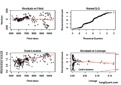
(For the Adjusted R-squared now is 0.966 > 0.8321)
The new formula is as following:
CSI500=3.18*SSE50-648.556
And the prediction trend:
The analysis of the formula:
How to use the chart to do the arbitrage:
As we used the sse50 as an independent variable to match csi500, the picture above showed that, the grey line, as the theoretical value of csi500, with the purple line and blue line as upper and lower bonds.
So if the actual value (red line) is higher than the grey line or even crosses the purple line, then we can say that csi500 is over-valued, and we can sell csi500 and buy sse50.
Vice versa, if the actual value (red line) is lower than the grey line or even crosses the blue line, we can say that csi500 is under-valued, and we can buy csi500 and sell sse50.
Yet we also would like to inform the investors that due to the limited data range and the market is not really efficient, this model should only be taken as a reference. Investors should also do sufficient fundamental analysis on the indexes. We can see from the picture above that since the begin of year 2016, the red line is mostly under the grey line, that is to say, investors were in favor of blue chips than small caps, which showed that investors had stay defensive. And we should also pay attention on the signal of rotation. For investors could not stay defensive for long, there would be time to long csi500 and short sse50 in our opinion. But before we could see those signals, whatever they’re quantitive or fundamental, investors can keep their long positions of sse50 in hope of more SOE reform initiated by the government.
Copyright by FangQuant.com
Currently no Comments.
Hot Topics
The 13rd China International Future Forum
The Shanghai Derivatives Energy Forum has received extensive attention from relevant industries both within and outside the borders.
Financial institutions deep explore commodity market opportunities, commodity index financial products show full-scale trend
R-Code for analysis: getKDJ
New indicator to analyze the arbitrage opportunities between sse50 and csi500
R-Code@June 06, 2016
Market review: January 11, 2017
The Great China Bubble: Anniversary Lessons and Outlook
Quant Investment in China A-share market
The hedge strategy between SSE50 and A50--Jan 13,2017
The arbitraging strategy between CSI300 and SSE50
Market review: June 17, 2016
Sleepless in London--Enda Homan(Allied Irish Banks Plc)
MSCI Rebuffs Chinese Equities for Third Time in Blow to Xi
Soros, Druckenmiller among hedgies profiting in market plunge